|
When graphed, the data in a set is arranged to show how the points are distributed throughout the set. These distributions show the spread (dispersion, variability, scatter) of the data. The spread may be stretched (covering a wider range) or squeezed (covering a narrower range).
The shape of a distribution is described by its number of peaks and by its possession of symmetry, its tendency to skew, or its uniformity. Distributions that are skewed have more points plotted on one side of the graph than on the other.
NOTE: If a graph has a single peak at the center of the distribution, it is called a bell shaped distribution. A bell shaped graph (bell curve) is a frequency distribution that resembles the outline of a bell when plotted on a graph. |
|
 Shapes of Distributions (the graphs): |
|
Histograms |
Dot Plots |
Box Plots
|
Note: The graphs shown below demonstrate the shapes of various sets of data.
The histogram, dot plot and box plot in each separate section represent the same data set from left to right. |
|
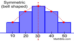
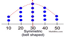
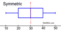
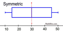
Symmetric (bell shaped) - when graphed, a vertical line drawn at the center will form mirror images, with the left half of the graph being the mirror image of the right half of the graph. In the histogram and dot plot, this shape is referred to as being a "bell shape" or a "mound". The most typical symmetric histogram or dot plot has the highest vertical column in the center. This shape is often referred to as being a "normal curve" (or normal distribution). Not all symmetric graphs, however, have this shape (see Symmetric U-shaped below).
|
|
|
 |
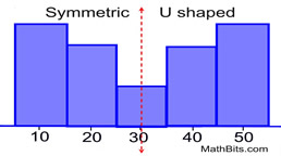
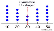
Symmetric (U-shaped) - as mentioned above, a symmetric graph forms a mirror image of itself when reflected in its vertical center line. Unlike the previous graphs, these histograms and dot plots have more of a U shape.
|
|
|
 |
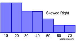
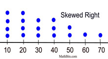
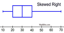
Skewed Right (positively skewed) - fewer data plots are found to the right of the graph (toward the larger numeric values). The "tail" of the graph is pulled toward higher positive numbers, or to the right. The mean typically gets pulled toward the tail, and is greater than the median. (There may be exceptions to the this last statement.)
|
|
|
|
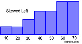
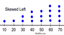
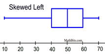
Skewed Left (negatively skewed) - fewer data plots are found to the left of the graph (toward the smaller numeric values). The "tail" of the graph is pulled toward the lower or negative numbers, or to the left. The mean typically gets pulled toward the tail, and is less than the median. (There may be exceptions to the this last statement.)
|
|
|
|
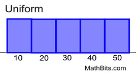
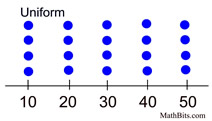
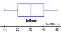
Uniform - The data is spread equally across the range. There are no clear peaks in these graphs, since each data entry appears the same number of times in the set. Notice in the box-plot how each section is of equal length: min to Q1, Q1 to median, median to Q3, and Q3 to max. These graphs are also symmetric.
|
|
|
 |

NOTE: The re-posting of materials (in part or whole) from this site to the Internet
is copyright violation
and is not considered "fair use" for educators. Please read the "Terms of Use". |
|
|